Penpal from the Netherlands.

Thanks for all the Amsterdam and Paris love you guys! These are continuing to be so fun to illustrate.

Speaking of the Amsterdam and the Netherlands....

A few years back, I fell in love with something I just couldn't have.

I thought maybe I only loved it because I couldn't have it. But then, I found a e-friend who lived in the netherlands who was willing to send me a copy of it and....I loved it.

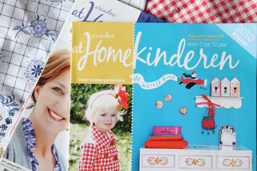
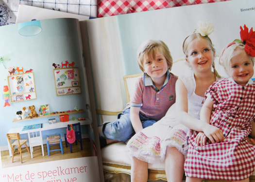
Ariadne at home is a popular magazine in the Netherlands....kind of like a Better homes and Gardens Magazine, or a Domino Magazine. All Dutch interiors. But they also have a Children's magazine that is delightful: Ariadne at Home-Kinderen. (Don't you love that word? Kinderen? I am telling you. I will learn Dutch someday.) But you can't get it sent to the states!

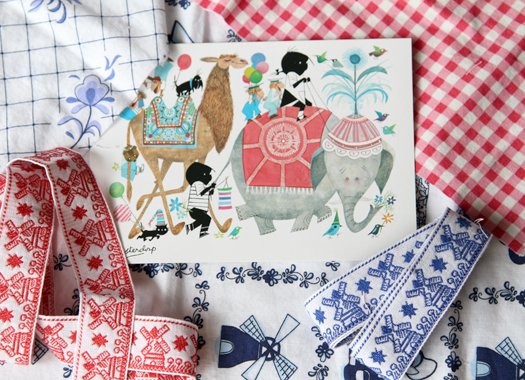
So when Nicole of Follow the White Bunny (ETSY embroidery designer in the Netherlands) offered to send me a copy, I was so thrilled! And look what she sent me along with it! Some dutch fabrics and ribbon, and a fun illustrated card. There is just something about getting something from a penpal that makes opening it feel like Christmas Morning.

But the magazine is full of such fun ideas and colors for children. I love the creativity invested....it just has it's own flair, and I love that it's not tainted by American branding. They do their own thing, and I get so inspired by that.

Anyways, thanks Nicole! I have sent her some "american" goods, but they just don't seem as wonderful, that's for sure:)

How about you? Have you ever thought of having a penpal? Try it. It's sure to please.

Organizing all that pretty stuff.

Pinterest. Have you heard? I just discovered it in January...maybe I'm slow...but I'm hooked.

Basically, it's an inspiration board for your online collections of all that stuff you love online. Being an artist, I'm constantly bookmarking, saving and downloading files that inspire me, give me some reference for a project I'm working on, or just plain make me smile. Huge problem solved! No more clogging up my "ideas" and "reference" folders on my desktop...now keep it all online, in categories for you  to reference!

It's seriously brilliant! I can just 'pin' any image I see online, and it goes right into my pinterest board. And it's a great way to keep track of the location of the image as well, so that you can find the original location as well as give credit to the original creator.

But beware. It's rather addicting. You can follow other people's boards, and make all sorts of friends...it's a heck of a lot of fun.

Do you have a pinterest board? Wanna follow mine? You can see it here. And if you have one...I wanna see:)

I just love brilliant people who think of these things. Don't you love smart people? The ones that make your life so much easier? I do. I love pinterest.

Drawing every day.

Ahhhhh.

I  just came back from a 3 day weekend with my husband. No kids. Just us! Oh my. I love  my kids....but getting away is really good. We haven't done something like that in 3 years...and it was much deserved! My poor sister might have had the biggest dose of birth control after tending them for the entire weekend, but hey. She's 20...so that's good:)

Over the weekend I caught up on much needed sleep. But I also allowed myself to draw and doodle with no agenda. Being a working illustrator can be a challenge because it's hard to justify the time to just "play." No agenda. No deadlines. Just play.

{image}

And this weekend, I recommitted myself to doing just that. I need to make time to doodle more, play more, discover my art more. That sounds really easy, but when I only really get 2 hours to myself at night to work, playing is hard to justify...as well as hard to find. But I also know that creativity isn't something that just comes. Even for someone like me, who thrives in creativity, it doesn't come naturally all the time. It takes constant effort. And that is what I hope my commitment to draw every day will do for me. Running a business and raising a family  and working on books and fabric, keeps me from drawing for just me. No one else but me...for sheer pleasure. And that's made me a bit down. So....here's to making it happen!

Color Stories.

Color.It's in everything we see. It'a all around, all the time. What does it say? And how do you choose to read it?

I've been thinking a lot of color stories. There are so many color combinations that I LOVE come from the every day things around me...but I just don't notice.  This year, I'm making a point to notice. These colors are making me tick this morning. Hoping for spring...hoping for spring...

{Photograph via with color notes by me}

P.S. And thank for all the cover love! I'll be showing you the inside soon enough!

What's not to love?

Oh dear, oh dear. In a hunt to find some color inspiration this morning, I may have found a possible addiction to another...yet another...Danish shop. This is bad. I'm officially addicted now. Have been for years...and no hope of recovering.

House Doctor: Home decor...nothing in the children's department that I can see yet...but I am loving their color and style: the perfect mix of bright colors against white or casual naturals. My favorite. Old meets new, neutral meets fresh and virbrant. Red meets pink. Yummy.

It's funny...since art and illustration is a natural extension of myself and what interests me, it's no wonder that design of all kinds inspires what I'm thinking about. I can be thinking about book illustration and get completely inspired by the color of a suitcase. Or the feel of a quilt. Or the color in an umbrella. It all meshes together into one big pot called, "eye candy." And today, it's no surprise: a little shop in Denmark.

Enjoy!

Back with color.

{via Room Seven}

Hello!

Happy New Year! Merry Christmas!

It's been a good break. You? I hope you're as refreshed as I feel. It's been a bit busy over here, which I never like over the holidays: namely lots of deadlines which I hope to talk about soon! But it's been wonderful to have everyone home. I always hate to send kids back off to school!

I'm back blogging again! I've missed you all. It's good to be back.

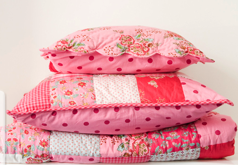
So....I've had my hands and head full to the brim with fabric. Color. Design. Color. Design. It's invigorating. Different enough from illustration to have given me a proper dose of all things COLOR. It's been so refreshing to think of colors and how they work together to make you feel a certain way. So, since I can't post what I've come up with so far....I'll post some color inspiration that I am currently enlivened by:

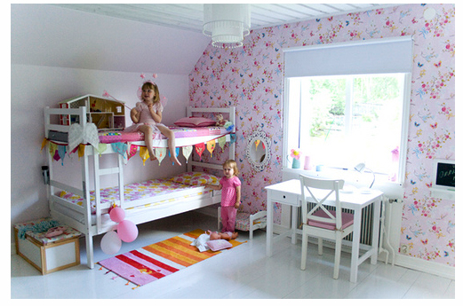
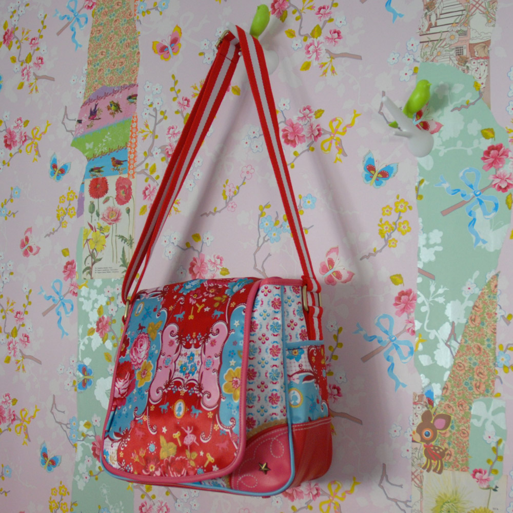
{From Craft & Creativity's Flickr Page: Pip Studio Wallpaper}

Have I told you my infatuation with all things Dutch and Scandinavian? Maybe not. Since I was 16, I was a gonner with anything that had a connection to the Netherlands, Sweden, Denmark...you name it. They are two technically different areas, but something about the way they celebrate color and how they push the limits against white (interesting for a territory dressed in snow so much of the year!)

So, it's no wonder that I have always loved Pip Design Studio and Room Seven: Two of my favorite places to get inspired. Both from the Netherlands.

Can you tell I like Red and Pink? Always have, always will.

It's interesting: I'm not always looking at style, but color and how it influences everything else. I always love looking at how the two elements of design work together.

I'll have to share with you more inspiration as I go. This is just a small part of what's getting my juices going lately!

Anyways, happy 2011 and can't wait to stop in more and say hi!

Ta-ta for now,

Sarah

Kiki & Coco.

Picture-12.png

I am needing a good pick-me-up today, and I've found it.

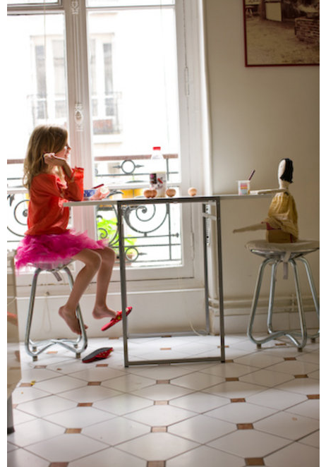
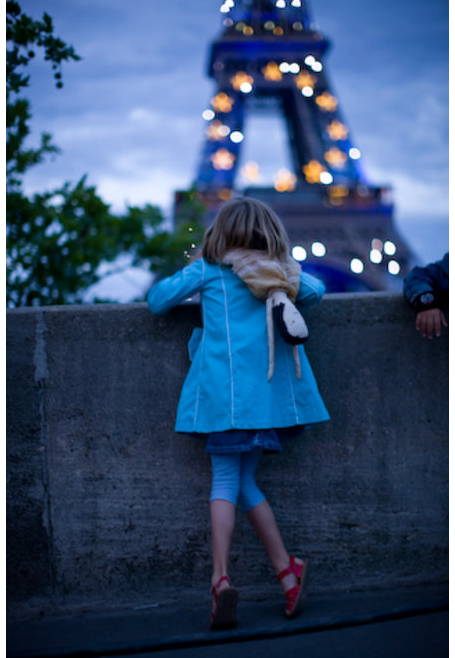
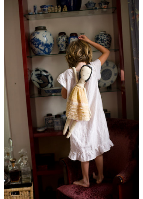
Found via Sugar City Journal last night, this video is making my entire month. Photographer-Mother-Stephanie Rausser photographed her little girl's trip to Paris with her best friend Coco...her rather perfect handmade rag-doll.

Click here for the darling, darling slide show. Honestly...I think I'm off to go make a Coco Doll for my girls. I made a small version for Addie last year, but this size is perfect!

Watch it and you'll laugh and cry. Its reminding me to see the way my children see their playthings. And it makes me want to go back to Paris. Really bad. Really, really bad.

P.S. The Paris Print is coming soon! By the end of the week, soon. It's so sweet. And when I'm done, I'm off to sew one of these:

And then maybe, just maybe, I'll be off to Paris.

And P.S. There is a super huge giveaway at Design Mom you'll want to check out today. $200 gift card to the shop, as well as another few hundred dollars in awesome giveaways. But it's only today, so hurry!

Wall to wall bulletin surface

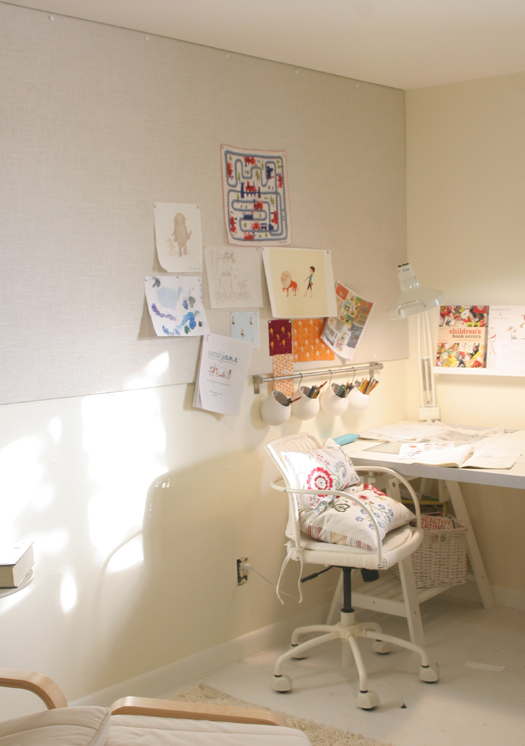
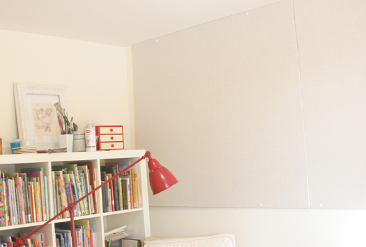
Over the Holiday, Kenneth and I finally got our wall to wall bulletin board up in the studio!

I've been tacking (and skotch-taping...shhh!) art to the walls since we moved in, and it's been rather messy (when you're working on a book, and you are taping paper up and down and up and down...art gets junked up fast!) I've been researching the best and most cost effective way to get a 4 ft. x 12 ft. bulletin board, and after a while of searching, I found it! Homosote.

Homosote is a 'green' product made from recycled paper, so it has a pulpy texture to it. You can read more about it here. I used the 440 Sound Barrier stuff. I think you can get cork surface and better looking tackable surfaces from them too, but the more basic board was what I found locally, and I wanted to wrap it in linen anyways. Builders use these boards for a boat load of things, like sound proofing rooms, etc. But I discovered online that tons of designers, artchitects, etc. use it to line walls to make a surface for mounting paper. Bingo! That's what I needed. It's super inexpensive ($30-ish for a 4x8 sheet) and thick enough to put tacks through (I got the 1/2 inch thick surface). Cork Board isn't even that thick, and much more pricey when you want to get an entire walls worth.

(By the way...I'm not advertising or anything...just sharing!)

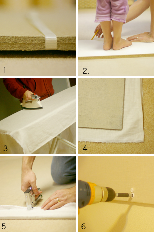
So, here's what we did:

1. First, here's a look at what it looks like. It's like a perfect blend between cardboard and wood.

2. We needed 2 sheets,  but not all of the second, so we cut it to size. Getting a little weight on there was helpful.

3. I covered the Homosote in linen, and ironed out the folds. Well, the incredibly-wonderful-man did. He irons too! The surface is fine on it's own, but brown wasn't what I was really wanted.

4. We laid the Homosote on top of the linen so we could wrap it like a canvas.

5. Staple guns are my friend.

6. When Ken drilled the board to the wall, we used these caps to cover the screws so that only the white cap would show, and not the screw head.

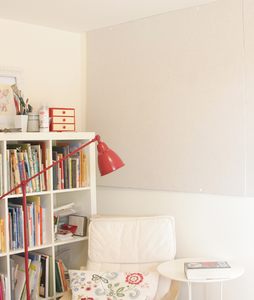
And now, I have a totally usable wall surface for laying out storyboards, colors, design swatches, to-do lists (no...scratch that) and the sort. Being a visual person, I need things in front of me to get the juices going. But not too much...I like clear space too. Can you tell?

You might think the studio is a bit sparce...well it is. But I am in no rush to make it perfect. It will evolve, but can I be honest with you? Life with 3 little children is so full and colorful (and cluttery and messy) that I crave clear white space when I create. It helps me dejunk from the day of noodles on my shirt and stains on the floor. It really does!

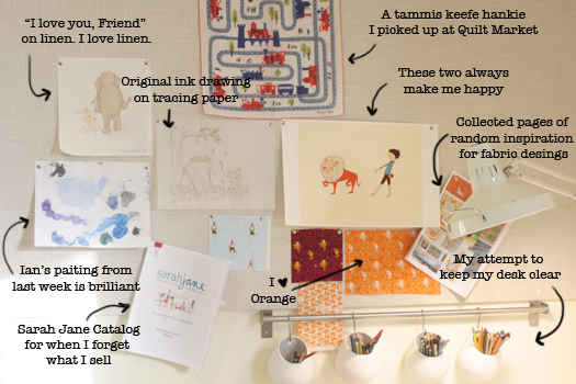
Here's what's on my board now. Nothing fancy...just what I am thinking about right now.

inspriation board blog

So. Studio space is coming together. Hooray!