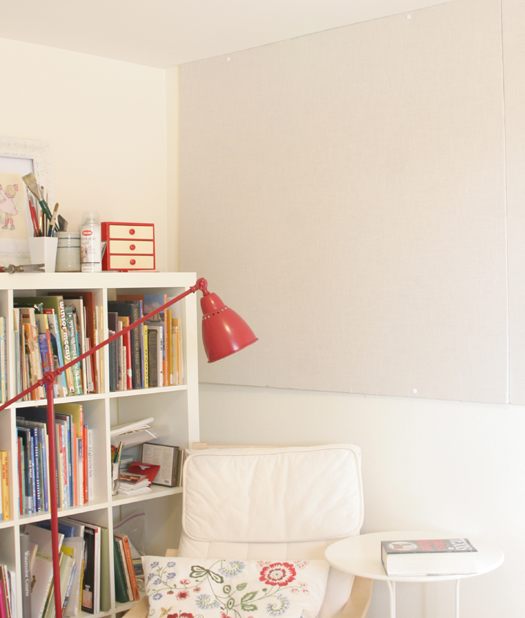
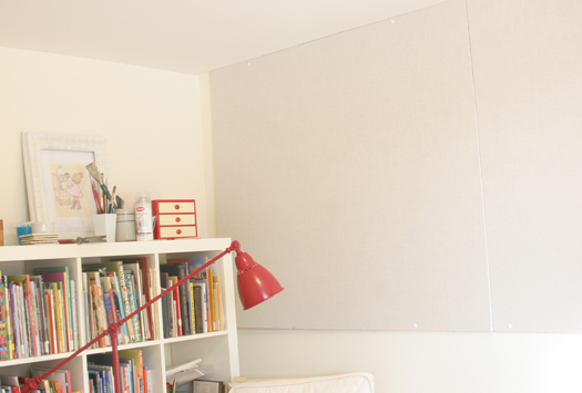
Over the Holiday, Kenneth and I finally got our wall to wall bulletin board up in the studio!
I've been tacking (and skotch-taping...shhh!) art to the walls since we moved in, and it's been rather messy (when you're working on a book, and you are taping paper up and down and up and down...art gets junked up fast!) I've been researching the best and most cost effective way to get a 4 ft. x 12 ft. bulletin board, and after a while of searching, I found it! Homosote.
Homosote is a 'green' product made from recycled paper, so it has a pulpy texture to it. You can read more about it here. I used the 440 Sound Barrier stuff. I think you can get cork surface and better looking tackable surfaces from them too, but the more basic board was what I found locally, and I wanted to wrap it in linen anyways. Builders use these boards for a boat load of things, like sound proofing rooms, etc. But I discovered online that tons of designers, artchitects, etc. use it to line walls to make a surface for mounting paper. Bingo! That's what I needed. It's super inexpensive ($30-ish for a 4x8 sheet) and thick enough to put tacks through (I got the 1/2 inch thick surface). Cork Board isn't even that thick, and much more pricey when you want to get an entire walls worth.
(By the way...I'm not advertising or anything...just sharing!)
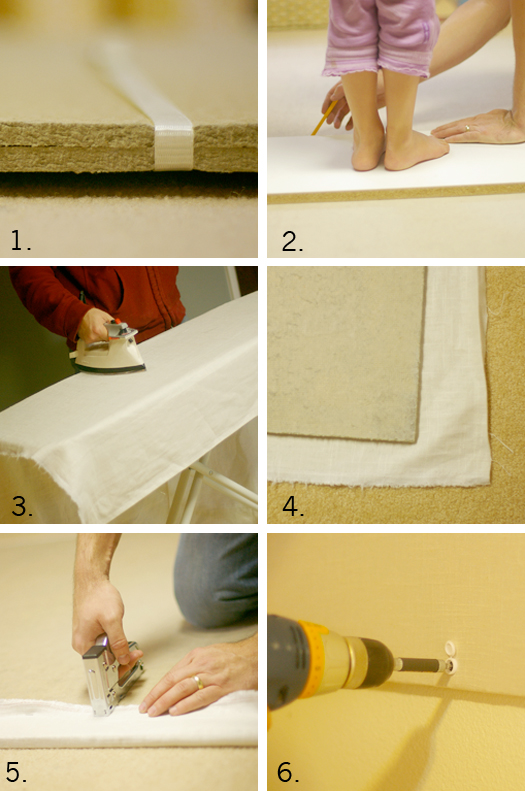
So, here's what we did:
1. First, here's a look at what it looks like. It's like a perfect blend between cardboard and wood.
2. We needed 2 sheets, but not all of the second, so we cut it to size. Getting a little weight on there was helpful.
3. I covered the Homosote in linen, and ironed out the folds. Well, the incredibly-wonderful-man did. He irons too! The surface is fine on it's own, but brown wasn't what I was really wanted.
4. We laid the Homosote on top of the linen so we could wrap it like a canvas.
5. Staple guns are my friend.
6. When Ken drilled the board to the wall, we used these caps to cover the screws so that only the white cap would show, and not the screw head.
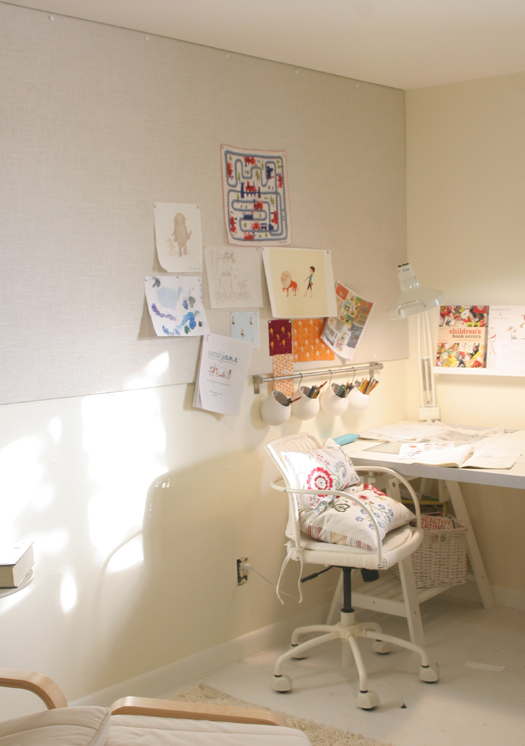
And now, I have a totally usable wall surface for laying out storyboards, colors, design swatches, to-do lists (no...scratch that) and the sort. Being a visual person, I need things in front of me to get the juices going. But not too much...I like clear space too. Can you tell?
You might think the studio is a bit sparce...well it is. But I am in no rush to make it perfect. It will evolve, but can I be honest with you? Life with 3 little children is so full and colorful (and cluttery and messy) that I crave clear white space when I create. It helps me dejunk from the day of noodles on my shirt and stains on the floor. It really does!
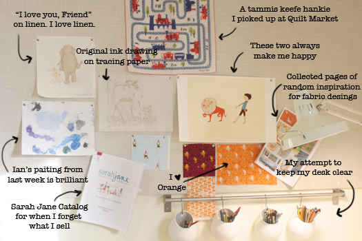
Here's what's on my board now. Nothing fancy...just what I am thinking about right now.
So. Studio space is coming together. Hooray!
