New Fall Shop Update!

Well, it's high time for some fresh new art. I've been antsy to get you some fresh prints for your kid's rooms, and I'm really excited about these!

This next collection is the beginning of what I hope will be a flourishing "Inspirational" art section in my shop. Coupled with colors from my fabric collection, these art prints are really getting me excited!

To be honest, this is the first art in a LONG while that I've been excited to put in my own children's rooms!

Right now, there are 3 girl prints, and 3 boy prints that coordinate really nicely with the Children at Play fabric line. Creating that collection was a real awesome experience for me, because I was able to think so much about color. Color that I've been wanting to see in my own art prints for a VERY long time!

"Love you more"... a daily phrase in our house. You? It usually starts out as a simple "I love you!" And then an "I love you too!" and on to "I love you more!"

Then onto:

Love you more than the moon

More than the world

More than chocolate

More than climbing trees

More than tigers

More than the zoo

And so on.

It used to end with "I love you most!"

But when Addie was 3, she came up with a really clever solution:

Addie: "I love you Da-gee-ga"

Me: Did you just make that up? What does that mean?

Addie: "It means I love you the most I could ever love you."

It has since become a family phrase, but it always starts with "I love you more!"

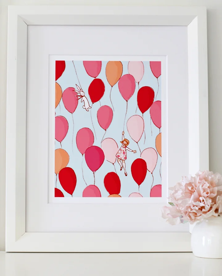
And of course, this Balloon Print. A definite favorite of the Children at Play prints. Who wouldn't want to fly sky high like that?

This how to make a paper hat, is actually my original version that I wanted to put onto fabric. The idea didn't translate over like I wanted to, so I'm super happy to make it a print. The first time I made a paper hat for my kids, I had to look it up online. Pretty sad. It had been too long since I made one as a child. This way, you'll never forget!

This print, from the Chasing Planes fabric, is Ian's favorite. I've always loved this phrase, but after doing some research on who it's quoted from, I'm realizing that it might be an undocumented name? If any of you have info, let me know. Richard Dumb is claimed to have said this, but according to the www I can't seem to find his existence, other than that he said this phrase and everyone loves it.

I've been shooting up a storm around here at the house. I'm about ready to launch a website (horray!!!) that will have a lot more of a comfy home feel, with lots of more pretty things to see. I won't give away too many secrets, but it's been so much fun to put together! Very much like building a house. For sure.

And the "BE" collection! Is in the shop now too. I have some lovely photos to share of these, but they'll be up a little later. I couldn't wait to get these in the shop...so many of you have been knocking on my door about these.

I have more to share about the motivation behind them, but for now, you can see them in the shop!

And the good news is,  you can purchase all of these in sets of 3 and 4, saving 20%

So, horray for new art! I hope you enjoy!

xo

Just Stay Little

I've seen some pretty darn cute birthday Parties out there on pinterest, and blogs and the online land of endless ideas. But I have yet to see a Birthday party inspired by a print of Fabric.

I saw this post this morning, and I just had to share!

Maggie of Smashed Peas and Carrots designed her littler girl's birthday party around the "Just Stay Little" print of fabric, complete with cutting out all the little dresses and making the cutest decorations! You can see more pictures here.

Just stay little...please? Just last night I noticed how big my babies are in their beds. Oh dear. Does it really happen? Do they really grow up? Don't answer that question.

Sorry if you are bored with seeing other people's creations with this fabric. To be honest, it  has become a wonderful fulfillment of a dream of mine. As a designer and illustrator, I've had many opportunities to choose where I contract my work. And as i've contemplated the products and the people I work with, my vision has always been to let the end product inspire more creativity out of the consumer. Seeing photos like this make me feel like it's all worth it. Art on the wall is nice, but I love seeing pictures of your puppet theaters, fabric creations and so many other things you've shown me.

Thanks for inspiring me!!

And also, are you going to The Creative Connection? Can't wait to see you there!

xo
sarah

Living life on purpose & other inspiration

Good morning all! Thanks so much for the great response to A Christmas Goodnight:) It's always a bit nerve wracking to share even a little bit of something that I've been keeping a secret for so long. I have so much more I want to fill you in on, but until then enjoy these last few weeks of summer...I promise I won't bug you about Christmas for at least another month:)

I wanted to share a few posts with you that are floating around the www today.

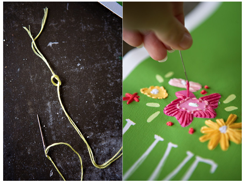
Ashley of Ashely Ann Photography (LOVE her blog and photography!) posted this great post of how she turned this free downloadable quote of mine into a canvas print which she embellished with hand stitching. Doesn't it look amazing?

{All Photos, Ashley Ann Photography}

I have my print behind glass in my kitchen...always such a lovely reminder to wake up every day full of love and purpose.

I made this print several weeks ago, but it has meant even more to me the past 2 days after recovering from a could-have-been-fatal car wreck. I'll spare you the horrific details, but let's just say it involved a bouncing metal pipe coming towards me on the freeway while going 65 mph in morning rush hour traffic. My car was totaled, 3 other cars were involved, and after spinning across 3 lanes of traffic, I walked away unharmed. Needless to say, I've been recovering on all levels, as you never expect to go through something like that. But if ever there was a shake in my soul to live my life with no regrets, it's been these past 48 hours. I can honestly say that I love my children every day like it will be my last, simply because I have always been so aware how fragile this life can be. But until you go through something like what I did Tuesday morning, am I shaken into living my life for God and my family with even more love than ever. The kind of purpose I didn't even know was in me. But now I do.

So...ok...onto happier things, Ashely is hosting a giveaway to get one 16x20 canvas print which you can use to print out that same quote. Isn't that great??

http://barij.typepad.com/.a/6a00d8347b268b53ef014e8ab28384970d-pi

And other lovely things going on in blog land, We Love French Knots hosted this great interview with me on Tuesday. Interviews are fun, because I get to share things I don't normally talk about here. Enjoy!

(Sorry I didn't link to it earlier...I was rather busy tuesday!) Bari J, a fantastic fabric designer and embroidery designer, started this fantastic Stitching Blog and has been relentless in filling us all in on all things stitching. Check it out!

{Overall Baby}

And guess what else you are making? I had to share these gorgeous photos of more wonderful projects you are making with Children at Play from my Flickr Group. You are all so talented and inspiring!

{Overall Baby}

Love to you all! Hug your babies. Live your life on purpose. Make your home beautiful. Inspire someone else. Be creative. Thank God every day for all his mercy. And laugh a lot. Amen.

Oh, and don't forget about the great giveaway over at Ashley Ann!

xo
sarah

Soft Spaces & more Children at Play

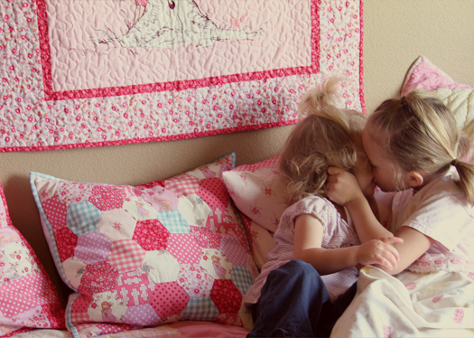
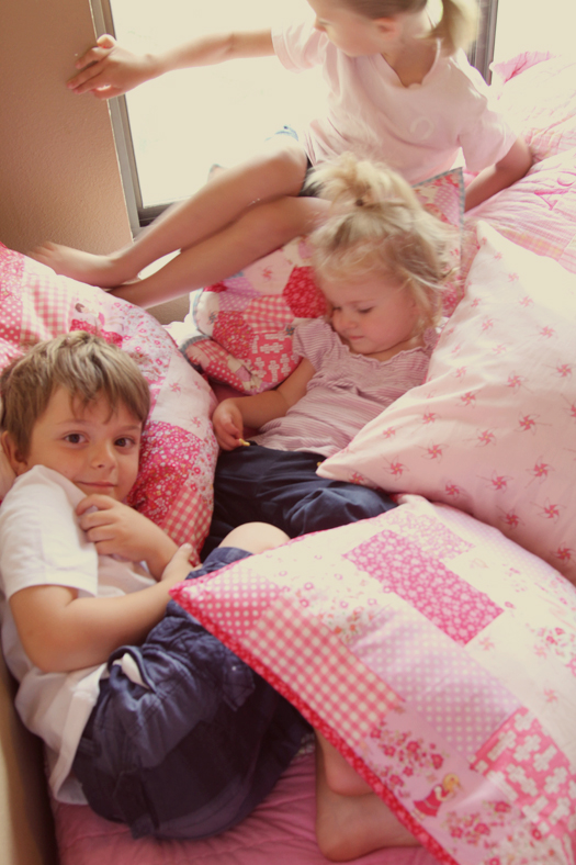
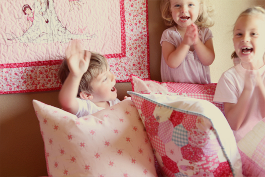
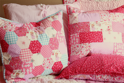
We're starting to get more soft spaces in the house.  It's been painful for me to not decorate my kids room when we first moved in to the house. When we moved in, I was in the beginning stages of getting fabric designed, and I knew I'd want to use Children at Play to decorate their room. The walls are the ugliest color, and we've been rather make shift with the space, but good things come to those who wait! I really hope to finish their space this summer, and really make it special. But it's coming along, and it's so wonderful to have these fabrics in their room...my kids love looking at all the details in the fabric. It's really so wonderful to watch them so responsive, and it just makes all the hard work worth it.

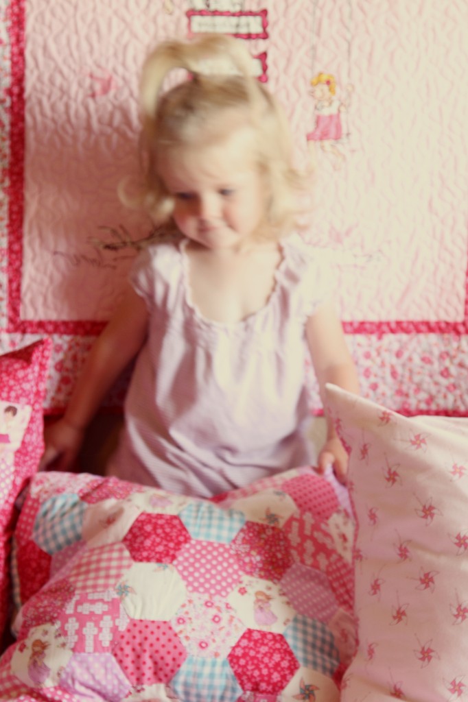
These particular pillows were made by Susan, and I still can't get over that hexagon pillow...all hand sewn and just gorgeous. Aren't they amazing? When we moved in, I was in the beginnings of get fabric designed, and so I didn't dare touch my children's bedroom because I knew I'd just want to sew for them with Children at Play fabric. So, the walls are still brown, but it's starting to be a much more welcome space.

These fabrics are a mix of the Meadow and Playhose line, fyi.I knew you'd ask:)

And, for the update, I just got word from Michael Miller, that the fabric is shipping out next week! I'll be making a list of retailers soon, so you can get it from your favorite shop. Horray! It's finally coming...can you believe it?

xo
sarah

Introducing: On Parade panel and a floor pillow project

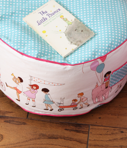
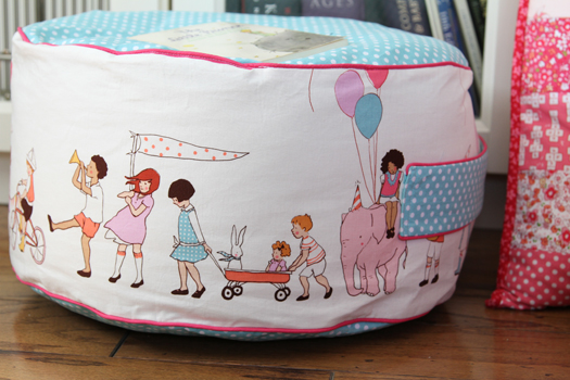
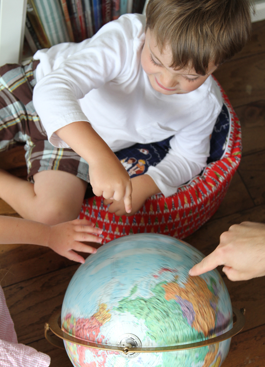
Hello! I'm back to show you some more fun we've had with this fabric. Children at Play was designed with a lot of projects in mind. As a designer, I really had to think about how this fabric would be used with children in mind: I thought about clothing, bedding, interiors and quilts. You'd think, "Well, of course...that includes it all!" But, when you are designig fabric, you really need to think about the end result. And this panel print was intended to be a runner for the bottom of skirts and dresses, but I hadn't realized how well it works for bedding or like this....floor pillows.
Now that I have this fabric in my hands, it's really amazing to see it in use. Being my first line, I've never had the experience of having something in my head translate into something in my hands like this. I mean, to see your illstrations on paper is one thing. But to have your children snuggle up and sit on them is another. I am still pinching myself!

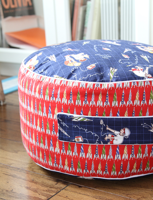
This is called On Parade, and it runs on both sides of the selvedge, so it can get double use.The one below is with the Rocket Launch Club and Rocket Prints. I am rather addicted...and want to make so many more!

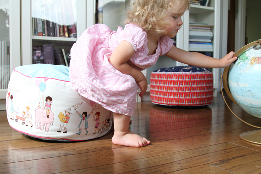
I found this floor pillow tutorial on Living with Punks, and this panel print works perfectly for it. It's inspired by the floor pillows at Pottery Barn, and are really nice because they are flat on the top, and they have a handle for the children to move around the house. Here's the post with pictures and instructions.

I will add that we added an inch to the top, and good 5 inches to the length of the side fabric to make it a wee bit bigger.  I also added some upholstery grade iron-on lining (by Pellon) to make it a bit more ready for lots of wear. You can get it at any general fabric store. It's a pretty easy project, and really fun to make!

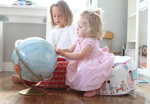
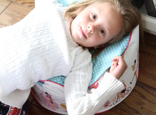
My kids love these. They really are the perfect portable furniture! I am SO glad I found this tutorial. They are getting a lot of use, and I think we need some more around the house. Right now we use them in the "library" (our living room) since we don't really have much furniture in the house. So I just had to share...I think you'll love making them too! Have fun!

Penpal from the Netherlands.

Thanks for all the Amsterdam and Paris love you guys! These are continuing to be so fun to illustrate.

Speaking of the Amsterdam and the Netherlands....

A few years back, I fell in love with something I just couldn't have.

I thought maybe I only loved it because I couldn't have it. But then, I found a e-friend who lived in the netherlands who was willing to send me a copy of it and....I loved it.

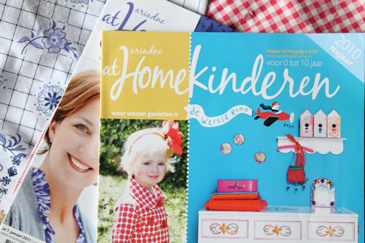
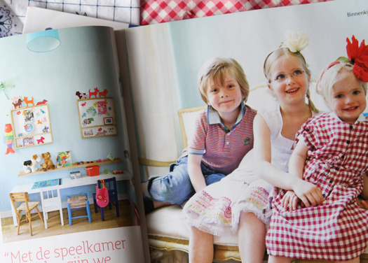
Ariadne at home is a popular magazine in the Netherlands....kind of like a Better homes and Gardens Magazine, or a Domino Magazine. All Dutch interiors. But they also have a Children's magazine that is delightful: Ariadne at Home-Kinderen. (Don't you love that word? Kinderen? I am telling you. I will learn Dutch someday.) But you can't get it sent to the states!

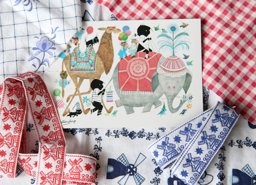
So when Nicole of Follow the White Bunny (ETSY embroidery designer in the Netherlands) offered to send me a copy, I was so thrilled! And look what she sent me along with it! Some dutch fabrics and ribbon, and a fun illustrated card. There is just something about getting something from a penpal that makes opening it feel like Christmas Morning.

But the magazine is full of such fun ideas and colors for children. I love the creativity invested....it just has it's own flair, and I love that it's not tainted by American branding. They do their own thing, and I get so inspired by that.

Anyways, thanks Nicole! I have sent her some "american" goods, but they just don't seem as wonderful, that's for sure:)

How about you? Have you ever thought of having a penpal? Try it. It's sure to please.

Commercial meets classic.

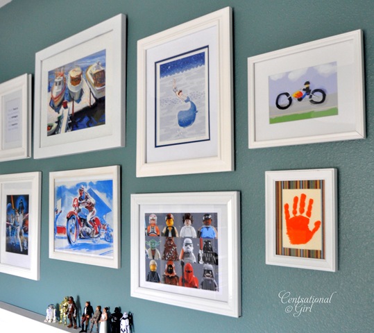
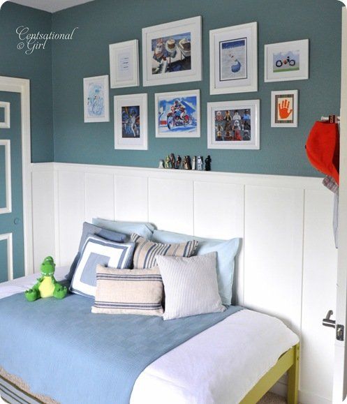
Kate over at Centsational Girl (fab interior design blog) just redid her little boy's bedroom, and I have to say I'm totally impressed. For a few reasons: She did a great job with color, but even more impressive to me: she solved a problem that I think a lot of mom's like me deal with: how to make action figures/commercially popular icon characters fit into your idea of a nice/simple space for your child.

Let me just say this first: I don't mind having commercially popular things in our home on occasion. But when it comes to "play" spaces, I am just really big on having spaces that foster creativity and imagination play with many things to do...and not dominated by just the commercial stuff. I've come to find that (for my kids at least) having too many "commercially popular" things around gets in the way of that kind of play. I guess what I am saying is, even for me....who has really strong opinions about good old fashioned play....still has to battle the ever stronger force of commercialism.

But the truth of it is...kids love those things. We don't even have TV (we watch movies...just not television) nor do we have video games. We're not Amish or anything....I just know how incredibly attractive and addicting those are, and I've seen how they can easily win the place over good books, educational play and imagination play. Nothing wrong at all with TV characters and toys....it's just that it gets harder to keep those things in check the older they get.  So how do  you incorporate what your child 'likes' and what you know they will 'like more?'

Enter Kate from Censational Girl.

She bought one of my prints (Whale Dreams) and I knew she was redecorating her son's room, and I was so interested to see how she was going to put the room together.

And I'm so impressed! She made a collage of all the fun things her son loves: Star Wars, Legos, Motercycles, Water, Boating all while keeping it classic and eclectic at the same time.  But this is how she did it: She chose everything to come together in blues. So Smart! It actually looks rather classic and nostalgic with the colors all working together.

And I must say the Whale Dreams print works so well. I never would have though that Sarah Jane art could look so good next to Lego Star Wars Figures.

And like I said: We're big star wars fans here, and lego fans...nothing wrong there. It's just how much the commercial aspect of it is around that I've put a lot of thought to.

Well, I may be walking a fine line here by saying what I would and would not hang up in my kids room...but tell me...have you had the same discussions with your children? Have you ever had to say things like, "No...I will not let you get a Mega Mind Bedspread. Sorry!"

I'd love to know your thoughts: How have you kept that balance between letting your children bring home all the "commercial stuff" while maintaining the kind of environment you envision for your kids? Am I the only one here who is constantly trying to keep the world out just a little bit longer?

Finn's Room.

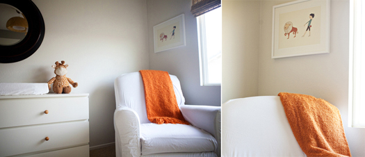
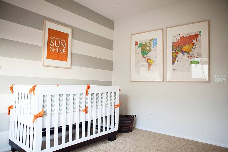
I love seeing room tours. Don't you? This orange and grey nursery was featured on Oh Dee Doh yesterday, and when I caught sight of it I fell in love.  I love how she incorporated the "Take Me For A Walk" print. (I think that's an 11x14 size if I'm not mistaken).

And the colors work great. Some of my favorites.

Lillie did a great job putting this room together. You'll have to check out her blog and  photography too. Her photography is super wonderful!

Finn (don't you love that name?) has a great set up. I'm still working on ours...but I go back and forth too much with what I want. I admire Lillie for just going for it!

Thanks for sharing!

**If you have any prints of Sarah Jane art that you wish to photograph and share, please do! I love seeing the spaces you put in them in and how you choose to display:)